How To Summarize Survey Results In Excel
Summarizing Survey Results in Excel
Excel is a powerful tool for summarizing and analyzing survey data, especially when you’re dealing with a moderate-sized dataset. Here’s a comprehensive guide to effectively summarizing survey results in Excel, covering various data types and techniques.
1. Data Preparation and Cleaning
Before diving into analysis, ensuring your data is clean and organized is paramount. * **Importing Data:** Import your survey data into Excel. Common formats include CSV (Comma Separated Values) and XLSX. Go to the “Data” tab, click “Get External Data,” and choose the appropriate source. * **Data Inspection:** Carefully review the imported data. Look for inconsistencies, errors, and missing values. * **Standardization:** Ensure consistent formatting for dates, numbers, and text. Use Excel’s formatting options to standardize these. For instance, use the “Format Cells” dialog (Ctrl+1) to set the number format to “Number” with the desired decimal places or to change date formats. * **Handling Missing Values:** Decide how to handle missing values. You can leave them blank, replace them with a specific value (e.g., “N/A” or 0), or use Excel functions like `IFERROR` to handle calculations involving these cells. Be aware that the chosen method impacts subsequent calculations. * **Removing Duplicates:** Use the “Remove Duplicates” feature (Data tab) to eliminate any duplicate survey responses. * **Text to Columns:** If data is crammed into a single column (e.g., multiple answers separated by commas), use the “Text to Columns” feature (Data tab) to split it into separate columns for easier analysis. Choose “Delimited” and specify the delimiter (e.g., comma).
2. Summarizing Closed-Ended Questions (Multiple Choice, Rating Scales)
Closed-ended questions offer structured responses, making them ideal for quantitative analysis in Excel. * **Frequency Distributions:** Calculate the frequency of each response option for each question. Use the `COUNTIF` function for this. For example, if your response options for a question are “Yes” and “No,” and your responses are in column B, use the following formulas: * `=COUNTIF(B:B,”Yes”)` (Counts the number of “Yes” responses) * `=COUNTIF(B:B,”No”)` (Counts the number of “No” responses) * **Percentage Calculations:** Divide the frequency of each response by the total number of responses to calculate the percentage. For instance: * `=(COUNTIF(B:B,”Yes”)/COUNTA(B:B))*100` (Calculates the percentage of “Yes” responses, using `COUNTA` to count non-blank cells in column B) * Format the cell as a percentage using the “%” button on the Home tab. * **Pivot Tables:** Pivot tables are exceptionally powerful for summarizing and cross-tabulating data. 1. Select your data range (including column headers). 2. Go to the “Insert” tab and click “PivotTable.” 3. Choose the location for your pivot table (new worksheet or existing worksheet). 4. In the PivotTable Fields pane, drag the question you want to analyze to the “Rows” area. This will list the unique response options. 5. Drag the same question again to the “Values” area. By default, it will likely show “Count of [Question]”. If not, click the dropdown arrow on the field in the “Values” area, select “Value Field Settings,” and choose “Count.” Pivot tables allow you to easily: * Calculate frequencies and percentages for each response option. * Cross-tabulate data: Drag another question to the “Columns” area to see how responses to one question vary based on responses to another. * Apply filters: Use the “Filters” area to narrow down the data being analyzed based on specific criteria. * **Charts and Graphs:** Visualize your summarized data using Excel’s charting capabilities. Highlight the summarized data (frequencies, percentages) and go to the “Insert” tab to choose a chart type. * **Bar charts:** Ideal for comparing frequencies of different response options. * **Pie charts:** Good for showing the proportion of each response option to the total. * **Line charts:** Useful for showing trends over time (if your survey included a time component). Customize your charts by adding titles, labels, and adjusting colors to make them clear and informative. * **Average and Standard Deviation (Rating Scales):** If you used rating scales (e.g., 1-5), calculate the average (mean) and standard deviation to understand the central tendency and variability of responses. * `=AVERAGE(B:B)` (Calculates the average of responses in column B) * `=STDEV.S(B:B)` (Calculates the sample standard deviation of responses in column B)
3. Summarizing Open-Ended Questions (Free Text)
Open-ended questions provide rich qualitative data, but summarizing them requires a different approach. Excel is primarily used for organizing and preparing the data for more in-depth qualitative analysis, often done with specialized software. * **Reading and Coding:** The most common method is to read through the responses and identify recurring themes or keywords. Create a coding scheme (a list of codes representing these themes) and assign each response one or more codes. You’ll need to manually create columns in your Excel sheet for each code. * **Keyword Analysis:** Look for frequently occurring words or phrases. This can give you a quick overview of the main topics being discussed. Use `COUNTIF` in conjunction with wildcard characters (“*”) to count responses containing specific keywords. For example, to count responses containing the word “customer”: * `=COUNTIF(C:C,”*customer*”)` (assuming open-ended responses are in column C). This will count any cell in column C that *contains* the word “customer,” regardless of where it appears in the text. * **Sentiment Analysis (Basic):** You can perform basic sentiment analysis by creating a list of positive and negative keywords. Count the number of positive and negative keywords in each response and assign a sentiment score. This is a simplified approach and may not be very accurate, but it can provide some initial insights. * **Word Clouds (Outside of Excel):** Export your open-ended responses to a text file and use a word cloud generator website or tool to create a visual representation of the most frequent words. This can help you quickly identify key themes. Many free online tools are available for generating word clouds. * **Organizing Coded Data:** Once you’ve coded your data, you can use Excel’s filtering and sorting capabilities to group responses based on their codes and analyze the relationships between them. Pivot tables can also be helpful here, by summarizing the frequency of different codes.
4. Creating Summary Reports
Once you’ve analyzed your data, create a concise and informative summary report. * **Executive Summary:** Provide a brief overview of the key findings. Highlight the most important trends and insights. * **Methodology:** Briefly describe the survey methodology (e.g., sample size, data collection method). * **Key Findings:** Present the results of your analysis, using tables, charts, and graphs to illustrate your points. Focus on the most significant findings and avoid overwhelming the reader with too much detail. * **Conclusions and Recommendations:** Draw conclusions based on your findings and offer recommendations for action. * **Appendices (Optional):** Include detailed tables and charts in an appendix if needed.
5. Tips and Best Practices
* **Plan your analysis:** Before you start, think about what you want to learn from your data and how you will analyze it. * **Use clear and concise labels:** Make sure your column headers and chart labels are easy to understand. * **Be consistent:** Use consistent formatting and terminology throughout your analysis. * **Double-check your work:** Carefully review your formulas and calculations to ensure accuracy. * **Protect your original data:** Create a copy of your original data and work on the copy. This prevents accidental data loss. * **Use Comments:** Add comments to cells containing formulas or explanations to document your work. Right-click on a cell and select “Insert Comment.” By following these steps, you can effectively summarize your survey results in Excel and gain valuable insights from your data. Remember that the specific techniques you use will depend on the types of questions you asked and the goals of your survey. For more in-depth analysis, consider using specialized statistical software.
 1680×1050 analyze survey results excel checkmarket from www.checkmarket.com
  480×360 summarize survey results pivot table excel microsoft from ms-office.wonderhowto.com
  768×449 charting survey results excel xelplus leila gharani from www.xelplus.com
 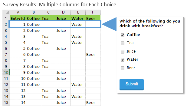 618×353 analyze survey data excel video excel campus from www.excelcampus.com