How To Make A Dashboard In Excel Using Charts And Slicers
Creating Dynamic Excel Dashboards with Charts and Slicers
Excel dashboards are powerful tools for visualizing data and gaining actionable insights. By combining charts and slicers, you can create interactive dashboards that allow users to explore data from different angles and identify trends quickly. This guide will walk you through the process of building a dynamic dashboard in Excel.
1. Data Preparation: The Foundation of Your Dashboard
The quality of your dashboard directly depends on the quality of your data. Before you start building the visual components, ensure your data is well-organized, clean, and structured appropriately.
* **Data Organization:** Your data should be in a tabular format with clear headers in the first row. Each column represents a specific field or category (e.g., Date, Product, Sales, Region), and each row represents a unique record. * **Data Cleaning:** Identify and correct any errors, inconsistencies, or missing values in your data. Inaccurate data can lead to misleading insights. Use Excel’s data cleaning features like `TRIM`, `CLEAN`, and `SUBSTITUTE` to remove unwanted spaces, characters, or replace incorrect entries. * **Data Validation:** Implement data validation to prevent incorrect data from being entered in the future. This involves setting rules for what type of data can be entered in specific cells (e.g., restricting date entries to a specific range, limiting text length, or providing a dropdown list of acceptable values). Use the “Data Validation” feature under the “Data” tab. * **Convert to Table:** Converting your data range into an Excel Table is crucial. Tables offer several benefits: they automatically expand when new data is added, support structured references (making formulas more readable), and integrate seamlessly with slicers and PivotTables. To convert your data into a table, select your data range and go to “Insert” > “Table.” Make sure the “My table has headers” checkbox is selected if your data includes header rows.
2. PivotTables: Aggregating and Summarizing Your Data
PivotTables are essential for summarizing and aggregating your data in various ways. They allow you to quickly calculate sums, averages, counts, and other statistical measures based on different categories within your dataset.
* **Creating a PivotTable:** Select any cell within your Excel Table and go to “Insert” > “PivotTable.” Choose the location where you want to place the PivotTable (either a new worksheet or an existing one). * **Choosing Fields:** The PivotTable Fields pane will appear. Drag and drop fields from the source data into the appropriate areas: * **Rows:** Fields that will appear as row labels in your PivotTable. * **Columns:** Fields that will appear as column labels. * **Values:** The numerical data you want to aggregate (e.g., Sales, Revenue). Excel will automatically sum the values, but you can change the calculation to average, count, etc., by right-clicking on the field in the Values area and selecting “Summarize Values By.” * **Filters:** Fields you want to use to filter the entire PivotTable. * **Formatting PivotTables:** Customize the appearance of your PivotTable to make it more readable. Change the number format, add subtotals or grand totals, and apply different styles. Use the “PivotTable Design” tab to customize the layout and appearance. * **Multiple PivotTables:** You will likely need multiple PivotTables, each summarizing the data from a different perspective (e.g., sales by region, sales by product, sales over time). Create separate PivotTables for each analysis you want to present on your dashboard.
3. Charts: Visualizing Your Data
Charts transform your PivotTable data into visually appealing representations. Choose the right chart type for the data you are presenting to ensure clarity and accuracy.
* **Creating Charts from PivotTables:** Select any cell within your PivotTable. Go to “Insert” > choose a chart type (e.g., Column Chart, Bar Chart, Line Chart, Pie Chart). Excel will automatically create a chart based on the PivotTable data. * **Choosing the Right Chart Type:** * **Column/Bar Charts:** Best for comparing values across different categories (e.g., sales by product, sales by region). Column charts are typically used when the categories are relatively few, while bar charts are better for a larger number of categories. * **Line Charts:** Best for showing trends over time (e.g., sales trends over months or years). * **Pie Charts:** Best for showing the proportion of different categories relative to the whole (e.g., market share of different products). Avoid using pie charts with too many slices, as they can become difficult to read. * **Scatter Plots:** Best for showing the relationship between two variables (e.g., advertising spend vs. sales revenue). * **Customizing Charts:** Customize your charts to improve their readability and visual appeal. Use the “Chart Design” and “Format” tabs to: * Add titles and axis labels. * Change colors and fonts. * Adjust axis scales. * Add data labels. * Remove unnecessary elements like gridlines.
4. Slicers: Adding Interactivity
Slicers are visual filters that allow users to interactively filter the data displayed in your PivotTables and charts. They provide a user-friendly way to explore different subsets of your data.
* **Adding Slicers:** Select any cell within your PivotTable. Go to “Insert” > “Slicer.” A list of available fields will appear. Select the fields you want to use as slicers. * **Connecting Slicers to Multiple PivotTables:** To make your dashboard truly interactive, connect each slicer to all the PivotTables (and consequently, the charts) on your dashboard. Select a slicer, go to the “Slicer” tab, and click on “Report Connections.” A dialog box will appear listing all the PivotTables in your workbook. Check the boxes next to the PivotTables you want to connect to the slicer. Repeat this process for each slicer. * **Slicer Styles:** Customize the appearance of your slicers to match the overall design of your dashboard. Use the “Slicer” tab to choose from pre-defined styles or create your own.
5. Dashboard Layout and Design
The layout and design of your dashboard are crucial for its effectiveness. A well-designed dashboard is easy to understand and navigate.
* **Dedicated Dashboard Sheet:** Create a separate worksheet specifically for your dashboard. This will keep your data and analysis separate from the visual presentation. * **Strategic Placement:** Place your charts and slicers in a logical and visually appealing arrangement. Consider the flow of information and how users will interact with the dashboard. * **Consistent Formatting:** Use consistent fonts, colors, and styles throughout your dashboard to create a professional and cohesive look. * **Titles and Labels:** Clearly label each chart and slicer to explain what data is being presented and how to use the controls. * **Background and Visuals:** Consider using a subtle background color or image to enhance the visual appeal of your dashboard. Avoid using overly distracting or cluttered designs. * **Grouping:** Group related charts and slicers together to improve organization. You can use shapes or borders to visually separate different sections of the dashboard. * **Testing:** Test your dashboard thoroughly to ensure that all charts and slicers are working correctly and that the data is being displayed accurately.
6. Advanced Tips
* **Named Ranges:** Use named ranges to make your formulas more readable and easier to maintain. * **Data Model:** For larger and more complex datasets, consider using Excel’s Data Model to create relationships between different tables. This allows you to build more sophisticated PivotTables and charts. * **Power Query:** Use Power Query (Get & Transform Data) to clean, transform, and load data from various sources into Excel. This can automate the data preparation process. * **Dynamic Chart Titles:** Create dynamic chart titles that update based on the slicer selections. You can use formulas and cell references to achieve this. * **Conditional Formatting:** Use conditional formatting in your source data or PivotTables to highlight key trends or anomalies. By following these steps, you can create interactive and informative Excel dashboards that empower users to explore data, gain insights, and make data-driven decisions. Remember to iterate and refine your dashboard based on user feedback to ensure it meets their specific needs.
 729×768 excel challenge slicers dynamically filter chart excel from www.exceldashboardtemplates.com
  450×253 microsoft excel dashboard report pivot charts slicers coderprog from coderprog.com
  740×317 making sales dashboard excel slicers kingexcelinfo from www.kingexcel.info
 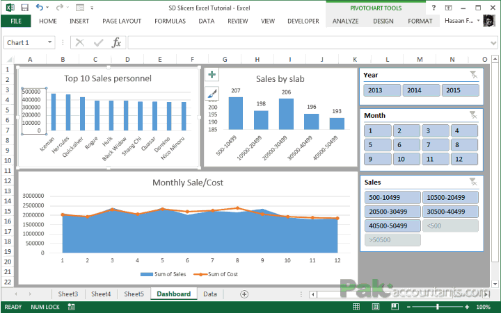 720×451 making sales dashboard excel slicers pakaccountantscom from pakaccountants.com
  974×726 create interactive excel dashboard slicers from maps-for-excel.com
  585×766 microsoft excel dashboard report pivot charts slicers softarchive from sanet.st