How To Add Data Labels To Chart In Excel
Adding data labels to charts in Excel is a fundamental way to enhance their clarity and interpretability. Data labels directly display the values associated with each data point, making it easier for viewers to understand the data without relying solely on the chart axes. This guide provides a comprehensive overview of how to add, customize, and manage data labels in Excel charts to create more informative and visually appealing presentations. **Adding Data Labels to a Chart** The simplest way to add data labels is through Excel’s built-in options: 1. **Create a Chart:** First, create the chart you want to enhance. Select the data range you want to chart (e.g., A1:B5) and go to the “Insert” tab. Choose the chart type you prefer (e.g., Column, Pie, Line). 2. **Select the Chart:** Click on the chart area to select it. This will make the “Chart Design” and “Format” tabs appear in the ribbon. 3. **Add Data Labels via Chart Design Tab:** * Click the “Chart Design” tab. * In the “Add Chart Element” dropdown menu within the “Chart Layouts” group, hover over “Data Labels.” * A submenu will appear, offering various placement options such as “Center,” “Left,” “Right,” “Above,” “Below,” “Inside End,” “Outside End,” “Best Fit,” and “Data Callout.” * Select the desired placement option. The data labels will automatically appear on your chart. 4. **Add Data Labels via Chart Elements Icon:** * Select the chart. * Click the “+” icon (Chart Elements) that appears to the top-right of the chart. * Check the box next to “Data Labels.” Excel will typically default to a placement like “Outside End” or “Best Fit.” * To further customize the label position, click the arrow next to “Data Labels” in the Chart Elements pane. This will open the same submenu as described in the “Chart Design” method, allowing you to choose the placement (Center, Left, etc.). **Customizing Data Labels** Once data labels are added, Excel provides extensive options to customize their appearance and content: 1. **Accessing Data Label Formatting Options:** * **Double-click a Data Label:** This will select all data labels in the series and open the “Format Data Labels” pane on the right side of the Excel window. * **Right-click a Data Label:** Right-click on a specific data label (or after selecting a series of labels) and choose “Format Data Labels…” from the context menu. 2. **Format Data Labels Pane:** The “Format Data Labels” pane contains several sections: * **Label Options:** This is the primary section for controlling label content, position, and appearance. * **Label Contains:** * **Value:** This displays the numerical value of the data point (the default). * **Series Name:** Displays the name of the data series the data point belongs to. Useful when you have multiple series in your chart. * **Category Name:** Displays the category name associated with the data point (e.g., the month in a monthly sales chart). * **Percentage:** Displays the data point’s value as a percentage of the total for its series. This is particularly useful for pie charts or stacked charts. * **Bubble Size:** Relevant for bubble charts, this displays the size of the bubble. * **Separator:** Allows you to specify the character used to separate multiple labels when displaying more than one option (e.g., “Value, Category Name”). Common options include comma, semicolon, space, or a new line. * **Label Position:** (Mirrors the options found in the “Add Chart Element” menu) Controls the physical placement of the label relative to the data point (e.g., Center, Inside End, Outside End). The available options depend on the chart type. * **Number:** Controls the format of the numbers displayed in the labels. You can choose from various categories (General, Number, Currency, Accounting, Date, Time, Percentage, Fraction, Scientific, Text, Custom) and specify the number of decimal places, thousand separators, currency symbols, etc. This is crucial for ensuring numbers are displayed accurately and consistently. * **Alignment:** Controls the horizontal and vertical alignment of the text within the data label. Options include left, center, right, top, middle, and bottom. You can also specify the text direction and custom angle. * **Fill:** Allows you to change the background color and transparency of the data labels. You can choose a solid color, gradient fill, picture or texture fill, or a pattern fill. Setting a background color can improve readability if the labels are difficult to see against the chart background. * **Border:** Adds a border around the data labels. You can customize the border color, width, and style (e.g., solid, dashed, dotted). * **Shadow:** Adds a shadow effect to the data labels. * **Glow and Soft Edges:** Adds a glow or softens the edges of the data labels for a more visually appealing effect. * **3-D Format:** Applies 3-D effects to the data labels (e.g., bevels, depth). * **Effect Options (Shadow, Glow, Soft Edges, 3-D Format):** These sections provide detailed controls over the visual effects applied to the data labels. The options are similar to those available for other chart elements. * **Size & Properties:** * **Text Box:** Controls settings related to the text box that contains the data label. You can specify the margins, word wrapping, and text direction within the box. * **Properties:** Allows you to control how the data labels interact with the chart when the chart size changes. You can choose to have the labels move and size with the chart, move but not size, or remain fixed. **Advanced Data Label Techniques** * **Custom Data Labels Using Formulas:** You can create custom data labels by linking them to cells in your worksheet using formulas. This allows you to display dynamically updated information within the data labels. * In the “Label Contains” section of the “Format Data Labels” pane, select “Value From Cells.” * Click the “Select Range…” button. * Select the range of cells that contain the custom labels you want to display. The number of cells in the range should match the number of data points in the series. * **Adding Leader Lines:** When data labels are placed far from their data points (e.g., in a pie chart), leader lines can help connect the label to the corresponding slice. * In the “Format Data Labels” pane, in the “Label Options” section, ensure “Show Leader Lines” is checked. * **Displaying Multiple Data Labels Per Point:** You can display multiple pieces of information in a single data label (e.g., value and percentage). Select the desired options in the “Label Contains” section and use the “Separator” option to control how the information is separated. * **Managing Overlapping Data Labels:** When data labels overlap, they can become difficult to read. Excel automatically tries to prevent overlap, but sometimes manual adjustments are necessary. Try different label positions, reduce the font size, or use leader lines to improve readability. In some cases, it might be necessary to selectively remove data labels that are causing the most overlap. **Tips for Effective Data Label Usage** * **Keep it Simple:** Avoid overcrowding the chart with too much information in the data labels. Focus on the most essential data points. * **Choose the Right Placement:** Experiment with different label positions to find the one that provides the best readability without obscuring the data. * **Use Consistent Formatting:** Apply consistent formatting (font, size, color) to all data labels to maintain a professional and uncluttered look. * **Consider Your Audience:** Tailor the data labels to the needs and understanding of your audience. If they are not familiar with the data, provide more context. * **Balance Aesthetics and Functionality:** While visual appeal is important, prioritize the clarity and accuracy of the data labels. By mastering the techniques for adding and customizing data labels in Excel, you can create charts that are not only visually appealing but also highly informative and easy to understand. Remember to consider your audience, prioritize clarity, and experiment with different options to find the best approach for your specific data and chart type.
 725×499 add move data labels excel chart from www.extendoffice.com
  840×325 add data labels column excel chart from www.extendoffice.com
 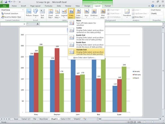 533×400 add data labels excel chart dummies from www.dummies.com
  919×433 add label excel chart auditexcelcoza ms excel training from www.auditexcel.co.za
  516×479 cell values excel chart labels from www.howtogeek.com