How To Create Gantt Chart With Dependencies In Excel
Here’s a guide on creating a Gantt chart with dependencies in Excel, formatted as requested:
Creating a Gantt chart in Excel, especially one that visualizes task dependencies, is a practical way to manage projects. While Excel isn’t dedicated project management software, it offers enough functionality for basic project visualization and tracking. This guide will walk you through the process.
Understanding the Basics
Before you start building the Gantt chart, it’s crucial to understand the core components:
- Tasks: These are the individual activities that need to be completed for the project.
- Start Date: The date on which a task begins.
- Duration: The length of time (usually in days) it takes to complete a task.
- End Date: The date on which a task is expected to be completed. This is automatically calculated based on the Start Date and Duration.
- Dependencies: The relationships between tasks. A task might be dependent on the completion of another task before it can begin. This is often represented as “Task A must finish before Task B can start”.
- Completion Percentage: How much of a task has been completed. Represented as a percentage, this provides a visual indicator of progress.
Setting Up Your Data
The first step is to organize your project information in an Excel sheet. Create columns for each of the core components mentioned above:
- Task Name (Column A): Enter the name of each task. For example: “Project Planning”, “Requirements Gathering”, “Design Phase”, “Development”, “Testing”, “Deployment”.
- Start Date (Column B): Enter the planned start date for each task. Use a date format that Excel recognizes (e.g., MM/DD/YYYY).
- Duration (Column C): Enter the estimated duration of each task in days.
- End Date (Column D): Calculate the end date using the formula: `=B2+C2-1` (assuming your first task’s Start Date is in cell B2 and Duration in C2). The “-1” is important because the duration includes the start date as a day. Copy this formula down for each task.
- Predecessor (Column E): This column will represent dependencies. Enter the row number of the task that *must* be completed before the current task can start. For example, if “Design Phase” (row 4) cannot begin until “Requirements Gathering” (row 3) is finished, then in the Predecessor column for “Design Phase” (E4), you would enter “3”. Leave blank for tasks with no predecessor.
- Completion (%) (Column F): Enter the percentage of completion for each task (e.g., 0%, 25%, 50%, 75%, 100%).
Example Data:
| Task Name | Start Date | Duration (Days) | End Date | Predecessor | Completion (%) |
|---|---|---|---|---|---|
| Project Planning | 10/26/2023 | 5 | 10/30/2023 | 100% | |
| Requirements Gathering | 10/31/2023 | 7 | 11/06/2023 | 1 | 75% |
| Design Phase | 11/07/2023 | 10 | 11/16/2023 | 2 | 25% |
| Development | 11/17/2023 | 15 | 12/01/2023 | 3 | 0% |
| Testing | 12/04/2023 | 7 | 12/10/2023 | 4 | 0% |
| Deployment | 12/11/2023 | 3 | 12/13/2023 | 5 | 0% |
Creating the Gantt Chart
Now for the visual part. We’ll create a stacked bar chart that mimics a Gantt chart.
- Insert a Stacked Bar Chart: Select the Task Name and Start Date columns (A and B). Go to the “Insert” tab on the ribbon, click on the “Bar Chart” dropdown, and choose “Stacked Bar”.
- Add Duration as a Second Series:
- Right-click on the chart and select “Select Data”.
- Click “Add”.
- For “Series name”, you can enter “Duration”.
- For “Series values”, select the range of cells containing the Duration values (e.g., `=Sheet1!$C$2:$C$7`). Make sure the cell references are correct for your sheet.
- Click “OK” twice to close the “Select Data Source” window.
- Format the Start Date Series:
- Click on the *first* series (the one representing the Start Date – it will be the leftmost bar for each task).
- Right-click and select “Format Data Series”.
- In the “Format Data Series” pane, go to the “Fill & Line” tab (the paint bucket icon).
- Choose “No fill”. This will make the Start Date portion of the bar invisible, effectively starting the bars at the correct date on the axis.
- Reverse the Task Order:
- Click on the vertical axis (the one showing the task names).
- Right-click and select “Format Axis”.
- In the “Format Axis” pane, under “Axis Options”, check the box “Categories in reverse order”. This will display your tasks in the correct order, from top to bottom.
- Adjust the Horizontal Axis (Date Axis):
- Click on the horizontal axis (the date axis).
- Right-click and select “Format Axis”.
- Determine the minimum and maximum dates you want to display on the axis. You can find these by looking at the earliest Start Date and the latest End Date in your data.
- In the “Format Axis” pane, under “Axis Options”:
- Set the “Minimum” and “Maximum” bounds. This requires converting the dates to their numeric representation in Excel. You can do this by simply entering the date in a cell and changing the cell format to “General”. Use these numeric values for the Minimum and Maximum bounds.
- Adjust the “Units” (Major and Minor) to a suitable interval (e.g., 7 for weekly intervals, 30 for monthly intervals).
Adding Dependencies Visually (Arrow Connectors)
Excel doesn’t have a built-in feature to automatically draw dependency arrows. You’ll need to add them manually using shapes.
- Insert Arrow Shapes: Go to the “Insert” tab, click “Shapes”, and choose an arrow shape (e.g., “Arrow”).
- Draw Arrows: Click and drag to draw an arrow from the end of the predecessor task’s bar to the beginning of the dependent task’s bar. Carefully position the arrows to accurately represent the dependencies.
- Format Arrows: You can format the arrows (color, thickness, style) by right-clicking on them and selecting “Format Shape”.
Important Note: Manually drawing arrows means they won’t automatically update if you change task dates or durations. You’ll need to adjust them manually.
Adding Completion Percentage
To visually represent the completion percentage, you can add another data series to the chart.
- Create a “Completed” Column (Column G): In a new column, calculate the number of days completed for each task using the formula: `=C2*F2` (Duration multiplied by Completion Percentage).
- Add the “Completed” Series:
- Right-click on the chart and select “Select Data”.
- Click “Add”.
- For “Series name”, enter “Completed”.
- For “Series values”, select the range of cells containing the “Completed” values (e.g., `=Sheet1!$G$2:$G$7`).
- Click “OK” twice.
- Format the “Completed” Series:
- Click on the “Completed” series in the chart.
- Right-click and select “Format Data Series”.
- Choose a fill color that represents the completed portion of the task (e.g., a darker shade of the task’s bar color). Consider using a solid fill for clarity.
- Order the Series: You might need to adjust the order of the series to ensure the “Completed” series is displayed *behind* the original “Duration” series. In the “Select Data Source” window, you can use the up/down arrows to change the order of the series. The series listed higher in the list will be displayed on top.
Considerations and Limitations
- Manual Updates: Excel Gantt charts require manual updating. Changes to task durations, start dates, or dependencies won’t automatically adjust the chart.
- Complexity: For complex projects with many dependencies, Excel can become cumbersome. Dedicated project management software is better suited for such scenarios.
- Lack of Collaboration: Excel isn’t designed for real-time collaboration like some project management tools.
- Arrow Maintenance: The dependency arrows are *not* linked to the task bars. If you move or resize a task, you *must* manually adjust the arrows.
Despite these limitations, an Excel Gantt chart is a valuable tool for visualizing and managing simple projects. By carefully organizing your data and using the techniques described above, you can create a clear and informative Gantt chart that helps you stay on track.
 1280×577 gantt chart excel understand task dependencies from www.ganttexcel.com
  466×232 understand task dependencies gantt excel from www.ganttexcel.com
 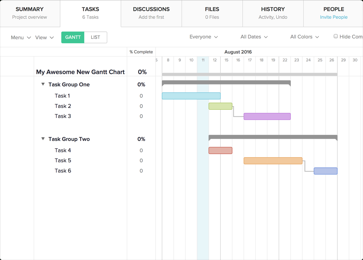 1232×884 excel gantt chart template dependencies db excelcom from db-excel.com
  1826×724 gantt chart dependencies templates smartsheet from www.smartsheet.com
  2712×2712 excel gantt chart dependencies links project planner spreadsheet from www.eloquens.com