How To Create Frequency Distribution In Excel
Frequency distributions are a fundamental tool in statistics for summarizing and visualizing the distribution of data. They show how often each value (or range of values) occurs in a dataset. Excel provides several methods for creating frequency distributions, catering to different needs and levels of detail. This guide will explore various approaches, from basic frequency counting to creating histograms with custom bins. **1. Basic Frequency Counting using the `COUNTIF` Function** The simplest way to create a frequency distribution in Excel is by using the `COUNTIF` function. This method is suitable when dealing with a relatively small set of distinct values or categories. * **Data Preparation:** Ensure your data is in a single column. For example, column A might contain the scores of students on a test. * **List Unique Values:** Identify the unique values in your dataset. You can manually list them in a separate column (e.g., column C) or use Excel’s “Remove Duplicates” feature. Select your data column (A), go to the “Data” tab, click “Remove Duplicates,” and choose the column containing your data. This will leave you with a list of distinct values. If the values are naturally categorical (e.g., colors, departments), you already have your list. * **Apply `COUNTIF`:** In the column next to your list of unique values (e.g., column D), use the `COUNTIF` function to count the occurrences of each value in your original data. The syntax is: `=COUNTIF(range, criteria)` Where: * `range` is the entire range of your data (e.g., `$A$1:$A$100`). Using absolute references (the dollar signs) ensures the range doesn’t change when you drag the formula down. * `criteria` is the cell containing the unique value you want to count (e.g., `C1`). So, the formula in cell D1 would be `=COUNTIF($A$1:$A$100, C1)`. Drag this formula down to apply it to all the unique values in column C. * **Interpretation:** Column D now shows the frequency of each unique value listed in column C. You can easily sum the values in column D to verify that the total frequency matches the number of data points in your original dataset. **Example:** | Column A (Scores) | Column C (Unique Scores) | Column D (Frequency) | | :—————- | :———————– | :——————- | | 75 | 60 | 2 | | 80 | 70 | 3 | | 70 | 75 | 2 | | 90 | 80 | 2 | | 60 | 90 | 1 | | 70 | | | | 80 | | | | 60 | | | | 75 | | | | 70 | | | | 90 | | | In this example, `COUNTIF($A$1:$A$11, C1)` in D1 would calculate the number of times 60 appears in column A, resulting in a value of 2. **2. Creating Binned Frequency Distributions using the `FREQUENCY` Function** When dealing with continuous data (e.g., height, weight, temperature), it’s often more useful to group the data into intervals, or “bins.” The `FREQUENCY` function efficiently calculates the frequency distribution for binned data. * **Data Preparation:** Your data should be in a single column. * **Define Bin Intervals:** Determine the intervals you want to use for grouping your data. List the *upper bounds* of these intervals in a separate column (e.g., column C). The `FREQUENCY` function counts values *up to and including* the upper bound of each bin. Carefully choose the bin intervals to provide meaningful insights. Overlapping bins will lead to incorrect results. Ensure that all possible data points are covered by the bins. You may need a very low bin and a very high bin depending on the range of your data. * **Select Output Range:** Select the *vertical* range of cells where you want the frequencies to appear (e.g., column D). The number of cells you select should be *one more* than the number of bin intervals you defined. The extra cell will contain the frequency of values greater than the largest bin upper bound. * **Enter the `FREQUENCY` Formula as an Array Formula:** While the output is a list of frequencies, the function needs to be entered as an array formula. With the output range selected, type: `=FREQUENCY(data_array, bins_array)` Where: * `data_array` is the range of your data (e.g., `$A$1:$A$100`). * `bins_array` is the range containing the upper bounds of your bin intervals (e.g., `$C$1:$C$10`). **Crucially, do not press Enter.** Instead, press **Ctrl+Shift+Enter** (or Cmd+Shift+Enter on a Mac). This enters the formula as an array formula, and Excel will automatically add curly braces `{}` around the formula. *Do not type the curly braces yourself.* * **Interpretation:** The selected cells in column D now contain the frequency of values falling within each bin interval. The last cell contains the frequency of values greater than the highest bin value. **Example:** | Column A (Temperatures) | Column C (Bin Upper Bounds) | Column D (Frequency) | | :———————– | :————————– | :——————- | | 22 | 20 | 2 | | 25 | 25 | 3 | | 18 | 30 | 3 | | 28 | 35 | 2 | | 32 | 40 | 0 | | 19 | | 0 | | 24 | | | | 27 | | | | 35 | | | | 15 | | | In this example, `=FREQUENCY($A$1:$A$10, $C$1:$C$5)` entered as an array formula will produce the following frequencies: * D1: Count of temperatures <= 20 * D2: Count of temperatures > 20 and <= 25 * D3: Count of temperatures > 25 and <= 30 * D4: Count of temperatures > 30 and <= 35 * D5: Count of temperatures > 35 and <= 40 * D6: Count of temperatures > 40 **3. Creating a Histogram using the Data Analysis Toolpak** Excel’s Data Analysis Toolpak provides a dedicated “Histogram” tool for creating frequency distributions and visualizing them as histograms. This method offers more control over the binning process and automatically generates a chart. * **Enable the Data Analysis Toolpak:** If you haven’t already, you need to enable the Data Analysis Toolpak. Go to “File” > “Options” > “Add-Ins.” In the “Manage” dropdown, select “Excel Add-ins” and click “Go.” Check the box next to “Analysis ToolPak” and click “OK.” You should now see the “Data Analysis” button in the “Data” tab. * **Data Preparation:** Your data should be in a single column. * **Define Bin Intervals (Optional):** As with the `FREQUENCY` function, you can define bin intervals by listing the *upper bounds* in a separate column. If you don’t define bins, Excel will automatically create them based on the data. However, defining your own bins provides greater control over the histogram’s appearance. * **Run the Histogram Tool:** Go to the “Data” tab and click “Data Analysis.” Select “Histogram” from the list and click “OK.” * **Input Range:** Enter the range of your data in the “Input Range” field (e.g., `$A$1:$A$100`). * **Bin Range (Optional):** If you defined bin intervals, enter the range containing the upper bounds in the “Bin Range” field (e.g., `$C$1:$C$10`). If you leave this blank, Excel will automatically create bins. * **Output Options:** Choose where you want the output to be displayed: * “New Worksheet Ply”: Creates a new sheet for the output. * “New Workbook”: Creates a new workbook for the output. * “Output Range”: Specifies a location in the current worksheet to display the output. Be careful not to overwrite existing data. * **Chart Output:** Check the “Chart Output” box to automatically generate a histogram based on the frequency distribution. * **Labels:** If your data range includes column headers, check the “Labels” box. * **Pareto (Sorted Histogram) and Cumulative Percentage:** These are optional features. “Pareto” sorts the bins by frequency in descending order. “Cumulative Percentage” adds a cumulative percentage line to the histogram. * **Click “OK”:** Excel will generate a frequency table and a histogram based on your settings. * **Customize the Histogram:** The automatically generated histogram may need some customization to improve its readability. Common customizations include: * **Removing Gaps Between Bars:** Right-click on any bar in the histogram, select “Format Data Series,” and set the “Gap Width” to 0%. * **Adding Axis Titles:** Click on the chart, go to the “Chart Design” tab, and use the “Add Chart Element” button to add titles to the horizontal and vertical axes. * **Adjusting Bin Labels:** The default bin labels might not be ideal. You can modify them by editing the frequency table generated by the toolpak and then adjusting the chart’s data source to reflect the changes. Alternatively, create the histogram in a blank sheet, and copy the titles from where you defined the Bin Ranges. * **Changing Colors and Styles:** Use the “Format Data Series” options to customize the appearance of the bars and the chart background. **Important Considerations:** * **Choosing Bin Intervals:** The choice of bin intervals significantly impacts the appearance and interpretation of the frequency distribution and histogram. Too few bins can hide important details, while too many bins can make the distribution appear noisy. Consider the nature of your data and experiment with different bin sizes to find a representation that best reveals the underlying patterns. Common approaches include Sturges’ Rule (k = 1 + 3.322 * log(n), where k is the number of bins and n is the number of data points) and the square root rule (k = sqrt(n)). * **Data Types:** Ensure your data is in the correct format (numeric for continuous data). * **Array Formulas:** Remember to enter the `FREQUENCY` function as an array formula (Ctrl+Shift+Enter). * **Toolpak Limitations:** The Data Analysis Toolpak’s histogram tool is somewhat limited in its customization options. For more advanced histogram creation and statistical analysis, consider using specialized statistical software or programming languages like Python with libraries like Matplotlib and Seaborn. * **Labeling and Clarity:** Always label your axes clearly and provide a descriptive title for your frequency distribution or histogram. Ensure the chart is easy to understand and conveys the intended message. By mastering these Excel techniques, you can effectively create frequency distributions and histograms to analyze and visualize your data, gaining valuable insights into its distribution and characteristics. Remember to choose the method that best suits your data and analysis goals, and always strive for clarity and accuracy in your presentation.
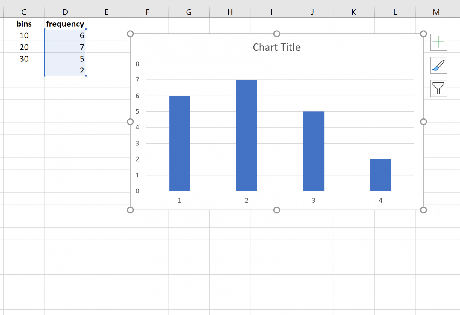 1536×1051 create frequency distribution excel from www.statology.org
  613×524 excel frequency distribution formula examples create from www.educba.com
 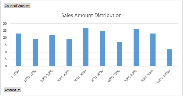 600×315 frequency distribution excel step step tutorial from www.excel-easy.com
  1280×600 create relative frequency distribution ms excel microsoft from ms-office.wonderhowto.com
 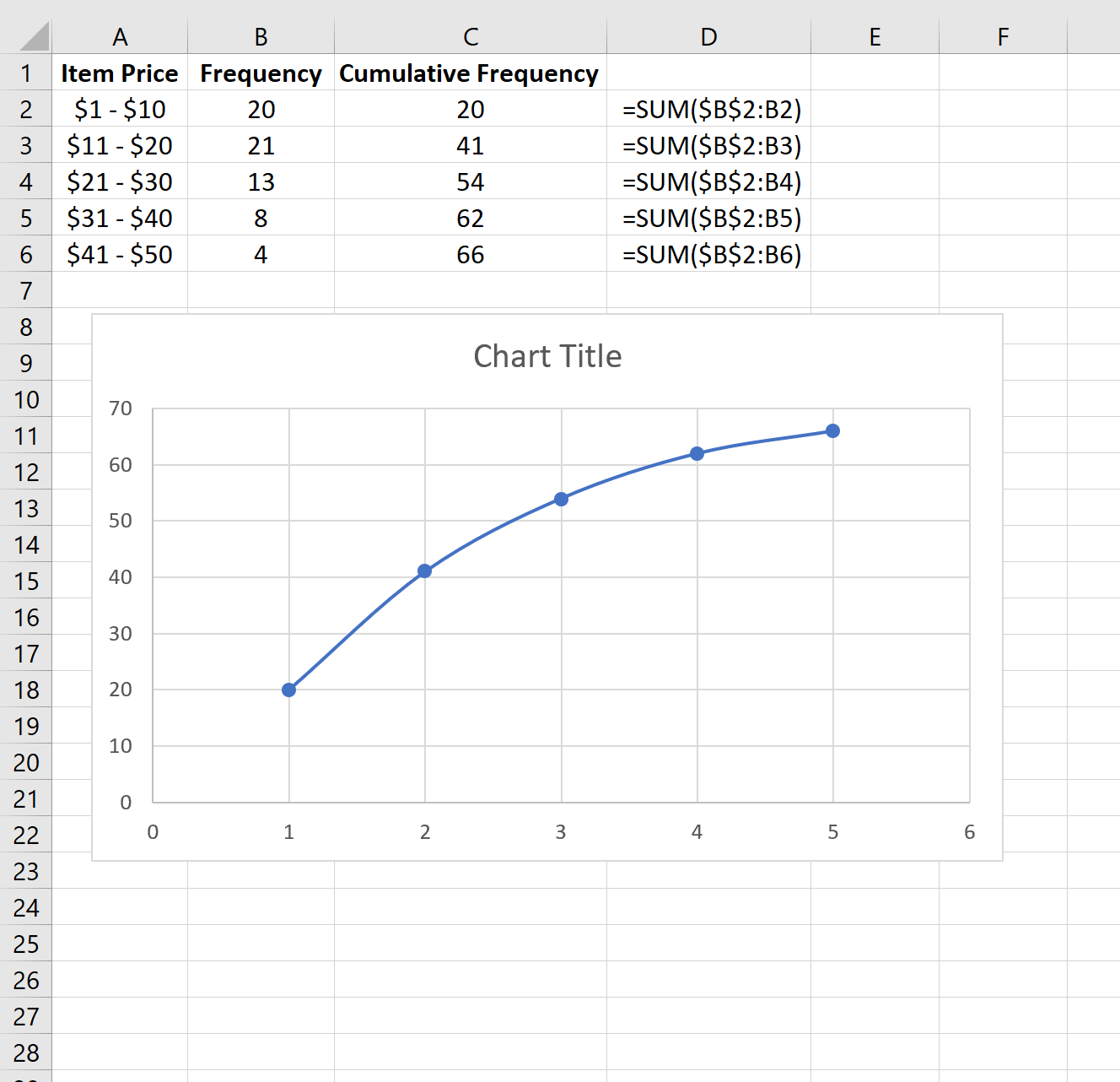 1328×1282 calculate cumulative frequency excel from www.statology.org