How To Create Burndown Chart In Excel For Agile Teams
Here’s a comprehensive guide on creating a Burndown Chart in Excel for Agile teams, formatted in HTML: “`html
Creating a Burndown Chart in Excel for Agile Teams
A burndown chart is a visual representation of work remaining in a project or sprint over time. It’s a key tool for Agile teams to track progress, identify potential roadblocks, and ensure timely completion of their goals. This guide will walk you through creating a simple yet effective burndown chart in Excel.
Understanding Burndown Charts
Before diving into Excel, let’s briefly understand the components of a burndown chart:
- X-axis (Horizontal): Represents the time frame, usually days within a sprint or iterations within a larger project.
- Y-axis (Vertical): Represents the amount of work remaining, typically measured in story points, tasks, or hours.
- Ideal Burn Rate (Ideal Line): A straight line showing the expected rate at which work should be completed, assuming consistent progress. It connects the starting point (total initial work) to the ending point (zero work remaining) over the sprint’s duration.
- Actual Burn Rate (Actual Line): A line showing the actual amount of work remaining at the end of each day or iteration. This line fluctuates based on the team’s actual progress.
Steps to Create a Burndown Chart in Excel
- Data Preparation: This is the most crucial step. You need to organize your sprint data in a clear and consistent manner.
- Setting up the Excel Sheet: Create the necessary columns in your Excel sheet.
- Calculating the Ideal Burn Rate: Determine the ideal progress line based on your sprint goals.
- Creating the Chart: Insert a chart in Excel to visualize your data.
- Customizing the Chart: Enhance the chart for better readability and understanding.
1. Data Preparation
Gather the following information for your sprint:
- Sprint Start Date: The date the sprint begins.
- Sprint Duration: The number of days in the sprint.
- Total Initial Work (Story Points, Hours, Tasks): The total amount of work planned for the sprint at the start. Ensure you have a consistent unit of measurement.
2. Setting up the Excel Sheet
Open a new Excel sheet and create the following columns:
- Day: Represents the day of the sprint (1, 2, 3, …).
- Date: The actual date corresponding to each day of the sprint. Use Excel’s date formatting to display the dates correctly.
- Ideal Remaining Work: The calculated amount of work that *should* be remaining on each day, based on the ideal burn rate.
- Actual Remaining Work: The actual amount of work remaining at the end of each day, updated as the sprint progresses. This is the data you’ll be tracking and entering daily.
Example Data (Assuming a 10-day sprint starting on 2024-01-26 and 50 story points of work):
| Day | Date | Ideal Remaining Work | Actual Remaining Work |
|---|---|---|---|
| 0 | 2024-01-26 | 50 | 50 |
| 1 | 2024-01-27 | 45 | 50 |
| 2 | 2024-01-28 | 40 | 42 |
| 3 | 2024-01-29 | 35 | 38 |
| 4 | 2024-01-30 | 30 | 38 |
| 5 | 2024-01-31 | 25 | 30 |
| 6 | 2024-02-01 | 20 | 25 |
| 7 | 2024-02-02 | 15 | 15 |
| 8 | 2024-02-03 | 10 | 10 |
| 9 | 2024-02-04 | 5 | 5 |
| 10 | 2024-02-05 | 0 | 0 |
3. Calculating the Ideal Burn Rate
The ideal burn rate represents how much work *should* be completed each day to finish on time. Here’s how to calculate it:
- Daily Burn Rate: Total Initial Work / Sprint Duration. In our example: 50 story points / 10 days = 5 story points per day.
Now, populate the “Ideal Remaining Work” column. The formula for each row will be:
Ideal Remaining Work = Previous Day’s Ideal Remaining Work – Daily Burn Rate
In our example, assuming the first row (Day 0) has “Total Initial Work” (50 story points), the formula in the second row’s “Ideal Remaining Work” cell would be: `=B2 – 5` (where B2 is the cell containing 50). Copy this formula down to the end of the sprint.
The “Day 0” row in “Ideal Remaining Work” should be equal to the “Total Initial Work”. The last row (Day 10) should be 0.
4. Creating the Chart
- Select Data: Select the “Date”, “Ideal Remaining Work”, and “Actual Remaining Work” columns (including the headers).
- Insert Chart: Go to the “Insert” tab in Excel and choose a chart type. A “Line” chart is the most appropriate for a burndown chart. Select a line chart with markers for better visualization.
Excel will automatically create a line chart showing the “Ideal Remaining Work” and “Actual Remaining Work” over time.
5. Customizing the Chart
Customize the chart to make it clearer and more informative:
- Chart Title: Add a clear title, such as “Sprint Burndown Chart – [Sprint Name]”.
- Axis Titles: Add titles to the X and Y axes. For example, “Date” for the X-axis and “Story Points Remaining” for the Y-axis.
- Legend: Ensure the legend clearly identifies the “Ideal Remaining Work” line and the “Actual Remaining Work” line.
- Axis Formatting:
- X-axis (Date): Format the date axis to display dates in a readable format (e.g., “Jan 26”, “26-Jan”). Adjust the scale if needed to clearly show all dates.
- Y-axis (Work Remaining): Set the minimum value to 0. Adjust the maximum value if necessary to provide adequate headroom above the initial work value.
- Gridlines: Consider adding or adjusting gridlines for easier readability.
- Line Styles and Colors: Use different colors and line styles to distinguish the “Ideal” and “Actual” lines. A dashed line for the “Ideal” line is common. Use thicker lines for better visibility.
- Data Labels: Consider adding data labels on the “Actual Remaining Work” line to show the story points remaining on each day. Right-click the line and select “Add Data Labels”.
Interpreting the Burndown Chart
Once your burndown chart is created, you can use it to track progress and identify potential issues:
- Staying on Track: If the “Actual” line is consistently below the “Ideal” line, the team is ahead of schedule.
- Behind Schedule: If the “Actual” line is consistently above the “Ideal” line, the team is behind schedule.
- Scope Creep: If the “Actual” line suddenly jumps up, it might indicate that new work has been added to the sprint (scope creep).
- Roadblocks: A flattening of the “Actual” line indicates that progress has stalled, suggesting potential roadblocks or dependencies.
Tips for Using Burndown Charts Effectively
- Daily Updates: Update the “Actual Remaining Work” column daily based on the team’s progress.
- Transparency: Make the burndown chart visible to the entire team and stakeholders.
- Regular Review: Discuss the burndown chart during daily stand-up meetings or sprint reviews to identify and address any issues.
- Flexibility: Don’t be afraid to adjust the plan if necessary. Burndown charts are a tool for tracking progress, not a rigid constraint. If the team identifies that they are consistently over- or under-estimating tasks, review the estimation techniques.
By following these steps, you can create a valuable burndown chart in Excel to help your Agile team track progress, identify potential problems, and deliver successful sprints.
“`
 853×466 agile burndown chart pm majik from www.pmmajik.com
  2523×1579 launched release burndown chart agile teams aha blog from blog.aha.io
 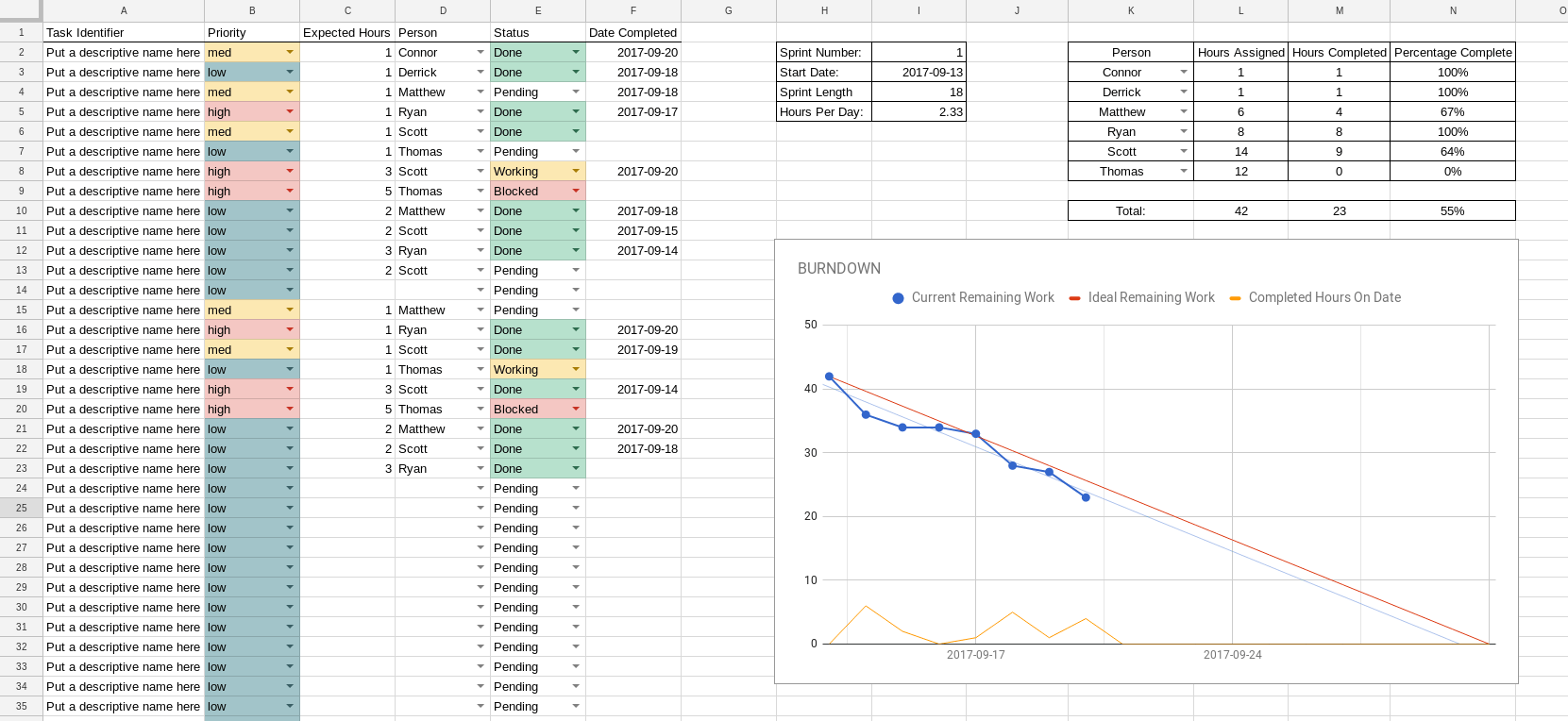 1661×764 agile burndown chart excel template hq printable documents from whoamuu.blogspot.com
  768×380 guide agile burndown chart excel template excelonist from www.excelonist.com
  1024×768 scrum burndown chart primer agile scrum from www.agile-scrum.be
 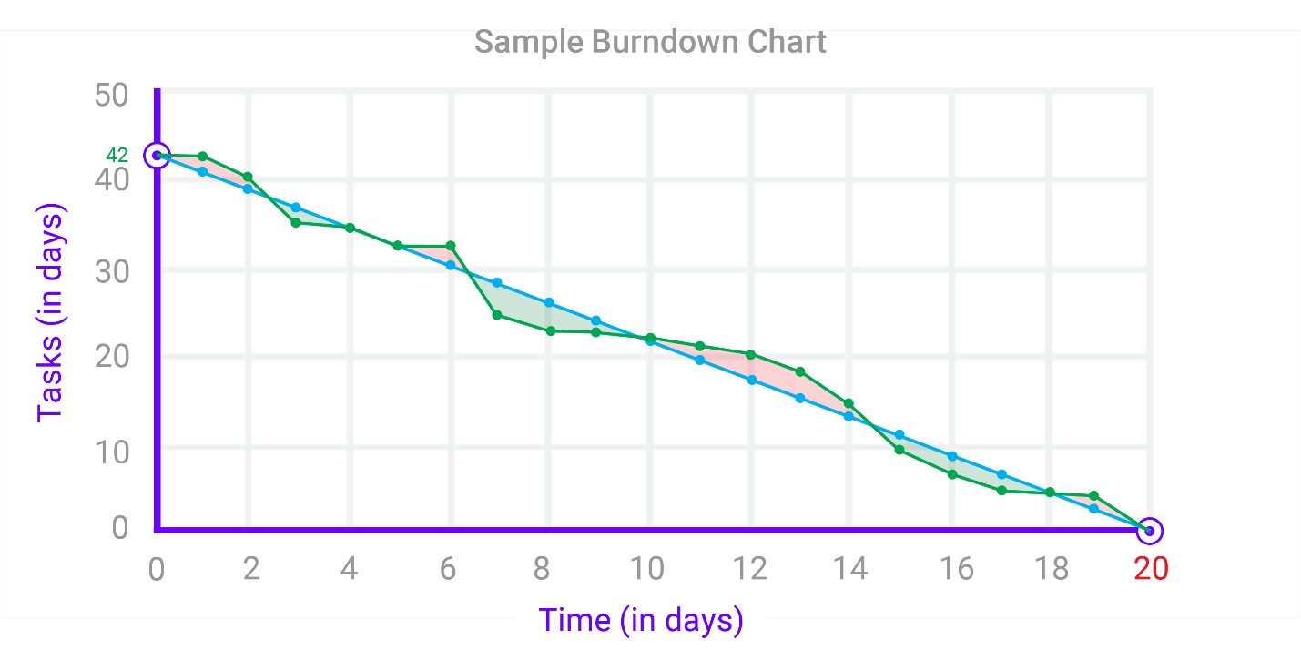 1429×714 components burndown charts agile development from elearningindustry.com