How To Calculate Moving Average In Excel With Chart
“`html
Calculating and Visualizing Moving Averages in Excel
Moving averages are a fundamental tool in time series analysis, used to smooth out short-term fluctuations and highlight longer-term trends. Excel provides simple yet powerful methods to calculate and visualize moving averages, making it accessible for users of all skill levels. This guide will walk you through the process step-by-step, from calculating the moving average to creating a dynamic chart that updates automatically.
Understanding Moving Averages
A moving average (MA) calculates the average of a set of data points over a specified period, and then “moves” this period forward to calculate the next average. This process is repeated across the entire dataset. The length of the period, often referred to as the “window,” is a crucial parameter. A shorter window will be more responsive to recent changes but may also be more susceptible to noise. A longer window will provide a smoother trend but may lag behind current movements.
Types of Moving Averages
- Simple Moving Average (SMA): The most common type, where each data point in the window is equally weighted.
- Weighted Moving Average (WMA): Assigns different weights to data points within the window, usually giving more weight to recent data. This makes the WMA more responsive than the SMA.
- Exponential Moving Average (EMA): Similar to WMA, but uses an exponential weighting factor. EMA is often preferred for its responsiveness and computational efficiency.
This guide will focus primarily on the Simple Moving Average (SMA) due to its simplicity and widespread use, but the principles can be adapted to other types.
Calculating the Simple Moving Average (SMA) in Excel
1. Preparing Your Data
Start with your time series data in two columns: one for the date/time period and the other for the corresponding value. For example:
| Date | Value |
|---|---|
| 1/1/2023 | 10 |
| 1/2/2023 | 12 |
| 1/3/2023 | 15 |
| 1/4/2023 | 13 |
| 1/5/2023 | 16 |
| 1/6/2023 | 18 |
| 1/7/2023 | 17 |
2. Determining the Window Size
Decide on the number of periods to include in the moving average calculation. Common choices are 5, 10, 20, 50, or 200, depending on the nature of your data and the desired level of smoothing. For this example, let’s use a 3-period moving average.
3. Applying the AVERAGE Function
In a new column (e.g., “3-Period Moving Average”), start calculating the moving average. The first few cells will be blank because you need at least three data points to calculate the first average. In our example, we’ll start calculating the moving average in the fourth row.
In the cell next to the third data point (e.g., D4 if your data starts in A2 and B2), enter the following formula:
=AVERAGE(B2:B4)
This formula calculates the average of the first three values (B2, B3, and B4).
4. Extending the Formula
Drag the fill handle (the small square at the bottom-right corner of the cell) down to apply the formula to the remaining data. Excel will automatically adjust the cell references, so D5 will calculate the average of B3:B5, D6 will calculate the average of B4:B6, and so on.
Your spreadsheet should now look something like this:
| Date | Value | 3-Period Moving Average |
|---|---|---|
| 1/1/2023 | 10 | |
| 1/2/2023 | 12 | |
| 1/3/2023 | 15 | =AVERAGE(B2:B4) |
| 1/4/2023 | 13 | =AVERAGE(B3:B5) |
| 1/5/2023 | 16 | =AVERAGE(B4:B6) |
| 1/6/2023 | 18 | =AVERAGE(B5:B7) |
| 1/7/2023 | 17 | =AVERAGE(B6:B8) |
Creating a Chart with the Moving Average
1. Selecting Your Data
Select the data you want to include in your chart. This typically includes the date column, the original value column, and the moving average column. Be sure to include the headers as well.
2. Inserting a Line Chart
Go to the “Insert” tab in the Excel ribbon. In the “Charts” group, click on the “Insert Line or Area Chart” dropdown menu. Choose a simple “Line” chart option (e.g., “Line with Markers” or “Line”).
Excel will create a chart showing both the original data and the moving average. You may notice that the moving average line doesn’t start at the beginning of the chart, as the initial values are blank due to the calculation requirement.
3. Customizing the Chart (Optional)
You can customize the chart to make it more visually appealing and informative:
- Chart Title: Click on the chart title to edit it. Give it a descriptive name, such as “Daily Sales with 3-Day Moving Average.”
- Axis Titles: Click on the “+” button next to the chart to add axis titles. Label the X-axis as “Date” and the Y-axis as “Value.”
- Legend: You can customize the legend by clicking on it. You can change its position or format its appearance.
- Line Colors and Styles: Double-click on a line to open the “Format Data Series” pane. Here, you can change the color, width, and style of the lines. Consider using a different color for the moving average to distinguish it from the original data. You can also add markers to the data points.
- Axis Formatting: Right-click on an axis and choose “Format Axis” to customize its scale, number format, and other properties. This is useful for setting appropriate minimum and maximum values for the axes.
- Gridlines: Adjust the visibility and appearance of gridlines to improve readability.
Making the Chart Dynamic
To make your chart truly useful, you can make it dynamic so that it automatically updates when you change the window size of the moving average. This can be achieved using a cell reference for the window size in the `AVERAGE` formula and using the `OFFSET` function.
1. Store the Window Size in a Cell
In an empty cell (e.g., G1), enter the number representing your desired window size (e.g., 3). This cell will hold the value of ‘n’ for our n-period moving average calculation.
2. Using the OFFSET Function
Instead of directly referencing cells like `B2:B4` in the `AVERAGE` function, we’ll use the `OFFSET` function to create a dynamic range. The `OFFSET` function takes a starting cell, a row offset, a column offset, a height, and a width as arguments.
Modify the moving average formula to use `OFFSET`. For example, starting from the first possible calculation row (assuming data starts in A2, B2, and the new MA column is D2):
=AVERAGE(OFFSET(B2,0,0,$G$1,1))
Let’s break down this formula:
- `B2`: This is our starting cell, the top of the data range we will average.
- `0`: The number of rows to move down from the starting cell. Since we want to start at the beginning of our data for that row, it’s 0.
- `0`: The number of columns to move right from the starting cell. We want to stay in the “Value” column, so it’s 0.
- `$G$1`: This is the height of the range, which is our window size. The `$` signs make it an absolute reference, so it doesn’t change when we drag the formula down.
- `1`: This is the width of the range, which is 1 because we’re only averaging values from one column.
Now drag this new formula down. The values will likely appear incorrect initially because of the OFFSET moving to blank cells. To correct for this, you will want to add a check to ensure you have enough values to calculate the average. Wrap the `AVERAGE` formula with an `IF` statement:
=IF(ROW()-ROW($B$2)+1>=$G$1,AVERAGE(OFFSET(B2,0,0,$G$1,1)),"")
Breaking this down:
ROW()-ROW($B$2)+1calculates the current row number relative to the starting data row. It essentially counts how many rows we are down from the start of the data.>=$G$1checks if the current row number is greater than or equal to the window size.- If the check is true (meaning we have enough data points), the `AVERAGE` calculation is performed.
- If the check is false (meaning we don’t have enough data points), an empty string “” is displayed, leaving the cell blank.
3. Update Chart Data Source
If the chart does not automatically reflect the changes, you might need to adjust the data source of the chart. Select the chart, go to the “Chart Design” tab (or “Chart” on older Excel versions), click “Select Data”. Ensure the chart data range accurately reflects the columns now containing the OFFSET-based moving average calculation.
4. Test and Adjust
Now, if you change the value in cell G1 (the window size), the moving average column and the chart will automatically update. Experiment with different window sizes to see how they affect the smoothing of the data.
Weighted Moving Average (WMA) Example
Here’s how you would calculate a 3-period WMA where the most recent value has a weight of 3, the middle value has a weight of 2, and the oldest value has a weight of 1. (Weights must add up to total weight. Ex 3,2,1 total 6. weight/totalweight is the actual weighting)
Using the data from above, the WMA formula (starting in cell D4) would be:
=((B4*3)+(B3*2)+(B2*1))/6
Adjust the formula for subsequent rows accordingly.
Conclusion
Calculating and visualizing moving averages in Excel is a powerful way to analyze time series data. By understanding the concepts and following the steps outlined in this guide, you can easily identify trends, smooth out noise, and gain valuable insights from your data. Remember to choose the appropriate window size based on the characteristics of your data and the desired level of smoothing. Experiment with different techniques and customizations to create charts that effectively communicate your findings.
“`
 1478×1487 find weighted moving averages excel from www.statology.org
 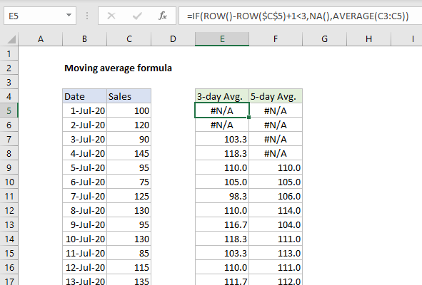 591×400 excel formula moving average formula exceljet from exceljet.net
 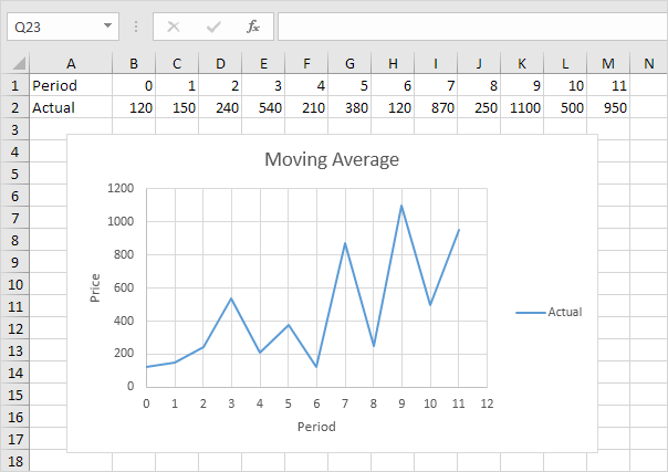 604×427 moving average excel step step tutorial from www.excel-easy.com